Showing posts with label color. Show all posts

Monday, September 24, 2012

a rainbow (and a shadow)

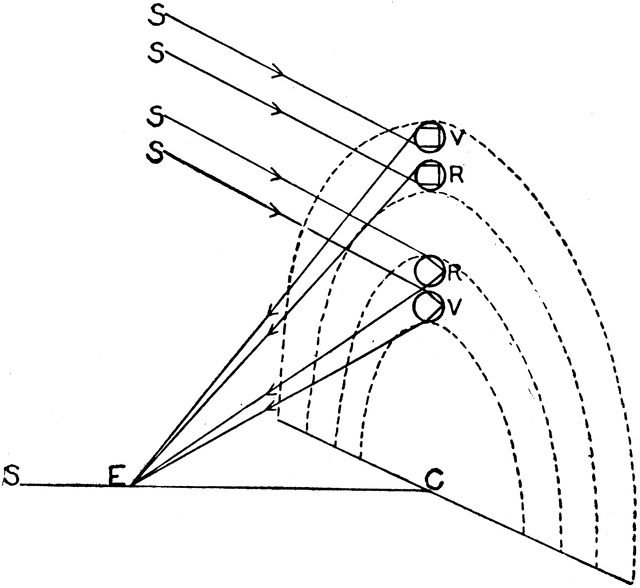
We all (should) know that rainbows are actually circular, although due to the angle at which we typically see them, and their enormous size, we rarely see the entire circle. Usually, just a fragment, a curved portion of a circle is visible.

[nota bene: one way to tell if an artist's illustration of a rainbow is taken from his imagination or "drawn from life" is to examine the angle of curvature. If the curvature of the rainbow is different from that of a segment of a circle, it's evidence that the rainbow is part of the artist's fantasy (or poor memory) and not an observed occurrence.]
My one prior (especially vivid) experience with a circular rainbow was on the Argentinian side of the IguaƧu Falls. The path for viewing the falls included a platform which allowed you to walk out over the basin of a particularly nice fall midway along it's height. Looking directly down into the spray of the water recoiling from its fall, with the sun high in the sky, a perfectly circular rainbow was visible below me in the spray.

Recently, however, I witnessed a circular rainbow in a new form. Flying over the British Isles, starting to come in low for our landing, but still above the intermittently thick (also low) cloud cover, I noticed a circular rainbow tracking our progress below us in the clouds. Against the background of the cloud, the rainbow looked quite tiny, bobbing up and down with each ripple in the cloud's surface.

Of course, the "movement" of the rainbow was really the movement of my perspective. The early morning sun was essentially behind me, shining along my line of sight (c.f. the midday sun shining behind me along my line of sight as I looked down into the spray of the Argentinian fall). Presumably, it was the water vapor of the clouds themselves (?) creating the appropriate refractive effect to send the rays of light back to me at slightly different angles for each wavelength.

As gaps in the clouds appeared, the rainbow would disappear, only to reemerge, apparently projected again against the clouds surface when they returned. I soon noticed the shadow of the plane—also tracking our progress and in my line of sight, of course—visible in the center of the rainbow's circle, approximately the same length as the rainbow's diameter.

Of course, the airplane's shadow didn't disappear during gaps in the cloud cover, but simply transferred itself to the surface of the earth. This fluctuation in the shadow's position nicely illustrated the phenomenon of size-distance invariance.

Since the respective positions of the sun, the plane, and me all stayed relatively fixed, and only the distance of the background against which the plane's shadow was projected changed, the shadow occupied the same visual angle on my retina in both positions. Yet, the plane's shadow on the ground appeared enormous compared to the tiny shadow within the circle of the traveling rainbow. This is because I perceived it as being more distant (since the ground appeared more distant than the surface of the crowd). Same visual angle, but greater distance means the "object" is larger (cover the head of your friend across the room with your thumb—same visual angle, but you perceive the thumb as small and the head as large), hence the changing size of the shadow.

The whole thing was rather magnificent.

Wednesday, March 28, 2012

decolorized iodine

Decolorized iodine, who'da thunk? When I was a kid, the way you knew the iodine hit was the way it stained your skin. No more. Sometime in the last 25 years, someone figured out how to take the color, and thence staining power, out of iodine. Who? The interwebs stand moot.

Why? So you don't have to worry about staining your clothes? Maybe sometimes additional factors inspiring more safety when handling a dangerous substance are a good thing . . .

Thursday, January 26, 2012

müller on mary

If, moreover, we imagine a man to be from his birth surrounded merely by external objects destitute of all variety of colours, so that he could never receive the impressions of colours from without, it is evident that the sense of vision might nevertheless have been no less perfect in him than in other men; for light and colours are innate endowments of his nature, and require merely a stimulus to render them manifest.

~ Joh. Müller (1840) Elements of Physiology

Friday, December 10, 2010

color in black and white

The experience of color television doesn't require a special TV. This is because of the Benham effect, which occurs when the experience of color is produced by rapidly oscillating patterns of white and black. Differences in the phase of this oscillation produce different color experiences.

You can experience the Benham effect for yourself here.

Although we don't know exactly what causes the Benham effect, we do know what relationship between phase and oscillation speed produces which color experience. In 1968, James Butterfield employed this knowledge to broadcast color information from a black and white TV camera to black and white TV sets. The idea is to use a rotating disk, half of which is black, the other half comprising a sequence of filters (in primary colors, red, green, and blue). The filters are placed to ensure that only the relevant color signal (whatever makes it through the filter) is phased appropriately with respect to the rotating disk. The end result is a flickering image which reproduces the sensation of color in the viewer, even though it is projected on a regular black and white television.

Read more about the Butterfield Color Encoder here.

According to Arthur Winfree:
Its first public demonstration was a soft-drink advertisement over station KNXT in Los Angeles. Nothing was said about color, to the consternation of thousands of viewers who seemed suddenly to be hallucinating. Its last public demonstration was in Argentina during political advertisements by Eva Peron.

~ Winfree (1980 / 2001) The Geometry of Biological Time, 2nd ed.

Friday, July 2, 2010

the life and times of martha washington

Is Casey a precursor of Martha Washington?

My interest in comics has waxed and waned in several waves, but the first major wave came in the late 80s when I first saw Frank Miller's Ronin. This was a little after it first came out, and I vividly remember the excitement I felt when, finally in the know, I walked away from the comic "shop" (barely more than a kiosk) with Batman: The Dark Knight Returns #3 and Watchmen #11, hot off the presses.

After Dark Knight and Watchmen set the bar so high, where to look next? An obvious choice was Give Me Liberty (1990), a four issue miniseries written by Dark Knight's Miller and illustrated by Watchmen's Dave Gibbons.

Now Gibbons' line has always seemed too clean and sterile to me. In fact, I was not that big a fan of his reading Watchmen, but his sheer connection to it (plus the obvious subtlety and detail with which he'd realized that complex project) made me enthusiastic for his work on the collaboration with Miller.

At the time, I had mixed feelings about Give Me Liberty. The story was over the top, the imagery was crazy and powerful, and Miller and Gibbons brought their distinctive personalities together into an explosive synthesis. Nevertheless, something felt unfinished, unsatisfying about the story. It was so sprawling, I felt something was left behind, even if I couldn't quite put my finger on it.

Miller's distinctive personality: gay nazis.

I had a vague sense more stories featuring the hero of Give Me Liberty, Martha Washington, had been published. But this was a period when my interest in comics was waning, and I never really followed her saga after the initial series.

Now, finally, however, the entire story (birth to death!) of Martha Washington, originally told in three miniseries and a handful of special issues, is collected in one place, the 600+ page The Life and Times of Martha Washington in the Twenty-First Century.

Martha is born in 1995. After a difficult youth in the ghetto, she joins "PAX," the near ubiquitous US government peace-keeping force. By the end of the first miniseries, the inevitable corruption of US economic policy, environmentalism as facism, state-instituted medicine as facism, the war on red meat, the oppression of the Apache Nation, and more have all been explored to satiric effect.

Martha had a rough childhood.

The second miniseries, Martha Washington Goes to War (1994), begins during the Second US Civil War. Martha defects to a utopian organization of the intelligent and competent, who have removed themselves from the totalitarian system which has taken over the former US. (Apparently, this story line is based on Atlas Shrugged.) Weather satellites, invisibility technology, giant golden pyramids, evil robot surgeons, and a omnipowerful super computer all play a part.

The third miniseries, Martha Washington Saves the World (1997) goes even farther over the top, pitting alien technology against a worldwide conspiracy. Finally, in 2007, Martha Washington's death was depicted in a final one-shot.

Reading Give Me Liberty again after all these years I've been reminded of just how exciting bizarre the story and its imagery were. I definitely have a greater appreciation for Gibbons' penmanship, and the color is extremely elegant. The same lingering feeling of unease, or of too much craziness and not enough depth in the characters / story remains. Nevertheless, the initial miniseries stands as a remarkable achievement.

Reading the rest of the story, its hard not to be distracted by the dramatic evolution in the coloring style. The second miniseries was a testing ground for a palate of new coloring techniques made possible by the digital computer, including even the flagrant pasting of photographic images into the backgrounds of some panels.

Coloring as digital photo collage.

Here, Washington discovers the utopian hideout and the lush green imagery literally pasted in creates a surreal effect and sharp contrast with the postapocalyptic wastelands we've seen so far in the story. Although tree photos are clearly pasted in to stand for trees, some of the pasting clearly plays a textural role, like the grass image pasted onto the hill, but not matching in scale or feel with the inked outlines of tufts of grass.

The use of digital techniques is even more extravagent in the third storyline, as a rogue asteroid and various astronomical structures are generated completely digitally, with no inked line at all. Here the final confrontation with the omnipresent intelligent computer system takes place within an entirely digital environment.

90s style digital playground.

Frankly, I prefer the colors and look of the first series (airbrush? watercolor?) to that of the later ones. Still, the digital excesses in the art are strangely appropriate to the narrative excesses of Frank Miller—in Martha Washington's epic, we can see the terse social commentary of the early Miller evolve into the carnivalesque self-parody on display in, for example, Batman: The Dark Knight Strikes Again. In the case of Batman, however, the "world" at stake (Batman's Gotham) was not really large enough to contain Miller's excess. In contrast, the world of Marha Washington is free to expand along with the style in Miller's sequels, consequently these work much better than DK2.

Ultimately, I think Martha Washington is one of the those characters loved a little too much by its creators (the deep affection both Miller and Gibbons feel for the character is attested repeatedly in the volume's liner notes). This makes certain features of her saga overly self-indulgent for my taste. Ultimately, however, the saga is deeply satisfying—perhaps some of their love rubs off on the reader. Or maybe the global vision presented is thought provoking enough to forgive some gaps in motivation or character.

More than that, however, the grandiose vision laid out of the future is so lighthearted and good spirited (despite the dark satire, it's always fun), that one can't help but play along, allow M&G their indulgences, and applaud an epic that manages to be grandiose and silly, brutal and lighthearted, frustrating and entertaining, all at the same time.

Friday, June 11, 2010

lazy colorist

I regularly come across colorist bloopers that make me question if they've really read the product - a background character's hair color changing from one from to another, or even parts of a main character's costume, colors which clash with those mentioned in the narrative, etc. One has to wonder sometime if anybody sits down and reads a comic cover to cover once it's complete, but before it's published.

I suppose these bloopers should be slightly more forgivable if the product was originally B&W and is being recolored for a new release. At least in this case, there's no reason to expect a close scrutiny of every page by the original artist(s). It can be frustrating, however, if the blooper appears to be the result of sheer laziness.

Consider for example the recent single volume rerelease of Brian Michael Bendis' (1999/2000) true Hollywood stories comic, Fortune and Glory.

Much of the story revolves around the endless hell of waiting rooms and pitch meetings which drives the business of Hollywood. As such, repetition in both images and story elements drives much of the humor of the exposé. Unfortunately, the gag on this particular page is sullied by the laziness of the colorist:
Not all the details of the art come across in this scan—in particular, the main character (our little bald friend)'s eyes are shifting back and forth in every frame. Then, in the final full panel on the page, the eccentric holding his pen in the air briefly puts his arm down for a rest. This nuance seems to have been lost on the colorist, who clearly just pasted the exact same colors onto this panel as the previous ones.

The finished product, however, is obviously f-d up—surely once the colors and inks were merged, only a quick glance (or the glance of an actual reader) was needed to spot the error?

Saturday, February 13, 2010

Monday, June 29, 2009

zabriskie point, warner NTSC transfer

too cold in the desert, unfortunately

more detailed review here

Thursday, June 25, 2009